
In my blog last week I discussed four ways Johannes Vermeer’s paintings can shape your home’s interior. Although you may think you and the 17th-century Dutch artist are worlds apart, you will find these ideas still hold true today. I am now including another four classic styles gleaned from Vermeer, who was one of the greatest painters of the Dutch Golden Age.

Shown: Girl With a Pearl Earring (1665)
1. Add drama with dark walls. Vermeer was a master of painting light. The contrast between his delicately lit subjects and dark backgrounds is dramatic and elegant.

Traditional Bathroom by London Interior Designers & Decorators Godrich Interiors
You can mimic Vermeer’s moody hues by painting your walls a dark hue. However, dark walls aren’t right for every space or aesthetic. Unlike whites, which are expansive and make a space feel larger, darks make a space feel smaller and more intimate.
Dark walls are a good choice for a room you want to make feel cozy, usually smaller spaces like a den or bedroom. In the bathroom shown here, it makes the sculptural sinks stand out. Coincidentally, this bathroom is painted in Farrow & Ball’s Hague Blue.
Painting the wood trim the same color as the wall helps maintain value cohesiveness versus breaking up the scheme with a light-colored trim.

Shown: A Young Woman Seated at a Virginal (1670-72)
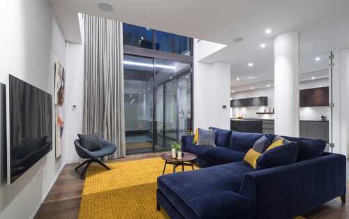
2. Try out a blue and yellow room scheme. Despite living in financially delicate circumstances, Vermeer insisted on using the rarest and most expensive pigments, such as ultramarine blue, lead-tin yellow and vermilion red. Yellow and blue are the predominant colors in many of Vermeer’s paintings.

Traditional Dining Room by Chagrin Falls Interior Designers & Decorators W Design Interiors
Blue and yellow go together remarkably well. While they’re not quite complements on the color wheel, they’re near cousins. (Blue’s complement is orange; yellow’s is purple.) Paired together, they create a pleasing energy that’s abuzz with nature tones. Yellow reminds us of the sun, and blue of the sea or sky.
Blue and yellow also balance each other’s color temperature – blue is a cool color, while yellow is a warm one. The duo in this living room and dining room transition is harmonious and striking.
Contemporary Living Room by London Photographers Tony Murray Photography
The combination of blue and yellow looks terrific in contemporary spaces too. This otherwise neutral home in London relies on the furnishings for color and texture.

Shown: Officer and Laughing Girl (circa 1657)
3. Map out your home. About half of Vermeer’s paintings show a large map on the wall. Jonathan Janson of The Vermeer Newsletter says maps were made for practical purposes, prestige and home decoration. In Vermeer’s day, they were a cheap way to embellish bare walls and exhibit Dutch mercantile domination of world trade. Janson says the maps were generally glued on heavy cloth and hung on rods. Balls on the rods kept the maps away from humid walls.

Contemporary Living Room by Toronto Kitchen & Bath Designers Toronto Interior Design Group | Yanic Simard
Maps are beautiful in their own right. They’re also a way to personalize your space with a location that holds special significance, like a hometown or favorite vacation spot.
Today, maps are more likely to be framed than hung, but glass size can pose a logistical problem. If your map is too large to frame (and it isn’t of significant historical or financial worth), consider breaking it into sections. This large map of Paris is handsome framed in four pieces.

Shown: The Milkmaid (1660)
4. Accept imperfection. Japanese culture has an aesthetic called wabi-sabi that’s focused on transience and imperfection. It’s unlikely Vermeer knew of this concept, but he hinted at it in his paintings. Look at the walls in The Milkmaid. See any crumbly, bumpy plaster under the window and above the baseboard tile? This is likely how the walls were, and Vermeer chose not to make them look new and smooth in his painting.
Although it isn’t advisable to put off the repair of crumbling building materials (you need to get to the heart of what’s causing the damage), there are instances when leaving things alone makes sense. Honoring old materials and celebrating how they change over time can be powerful.

Eclectic Bathroom by Metairie Interior Designers & Decorators Logan Killen Interiors
These brick and stucco walls are nearly 200 years old and were uncovered during a renovation. Just as Vermeer didn’t edit out the wall damage in his painting, these designers didn’t want to cover up these walls with new material, but rather showcase their history instead. So they secured loose areas, and left the walls and wood beams exposed as they were.
Are you interested in renovating or building your dream home?
In business over forty years, Wolford Building and Remodeling
has the expertise to create a home that is a Work of Art!!
Visit us at:
